
Is my website responsive & mobile-friendly?
Responsive web design and mobile-friendly checklist
If you have a responsive website, or you’re looking to get one, this post is for you.
I’m sure you know, having your website display on mobile devices is important. You might not know why, or how important it really is, but you know enough to know that you need it.
But do you know “what” really makes your website mobile friendly or responsive? It’s more than just how it looks, much more.
If you’re going to be spending the money on a new responsive website, it’d be best to know that you’re getting what you paid for.

Just because it “appears” to be right, doesn’t mean it was done right.
It’s really easy for web designers to cut a lot of corners and give you the bare minimum, something that “looks” right, but is far from it.
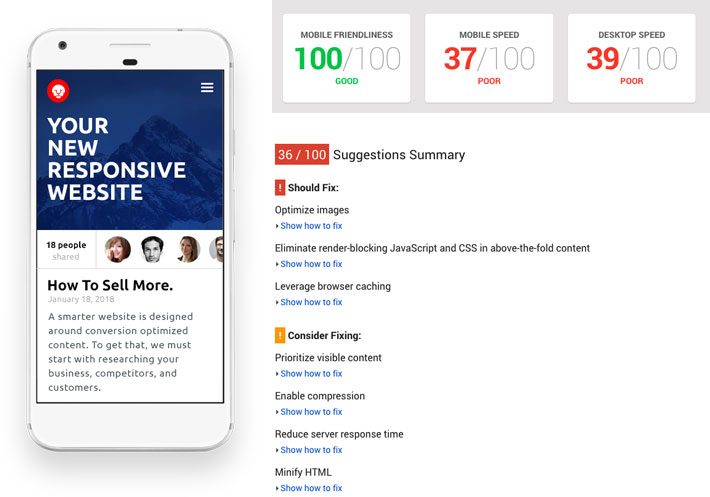
How fast is your website on mobile?
When it comes to responsive web design, what you can see is only the tip of the iceberg. “How” a website is coded is just as important as how it looks.
So, how can you know if your website is truly responsive and mobile friendly?
Dan has created a checklist just for you!
Get the Website Owner’s Mobile Friendly Checklist
Download the resource1
What makes a website responsive?
A responsive website incorporates a page layout that “responds” to any screen size and is optimized for speedy file delivery over data-strapped networks.
Put another way, a responsive website looks great no matter what it’s being viewed on and its fast – and it makes Google happy!
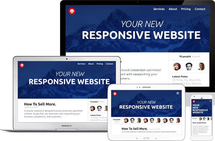
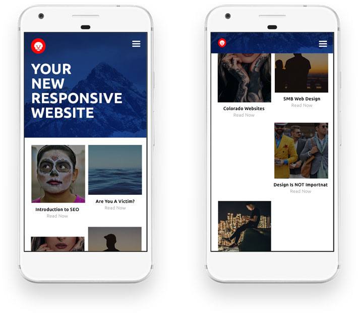
Your website should look great no matter the device you use.
Is it really responsive?
There are so many things that can go wrong with a responsive website. If your website has any of the problems listed in the checklist, you are going to frustrate and lose your site visitors. You’ll also upset the almighty Google.

You’re not the only website out there. Give a bad experience to your users, and they’ll bounce and never come back.
And the only thing worse than upsetting Google is encouraging your site visitors to bounce (leave).
2
Website Usability Test
How usable is your website for a finger?
At first glance, it’s pretty easy to see if a website is responsive or not. However, it’s not uncommon for things to get overlooked or missed.
Is your layout mobile friendly?
It’s amazing how many big brands make their website’s responsive but ignore the fact a mobile site visitor uses a finger and not a mouse.
The most common problems that occur when converting an existing desktop website into a mobile friendly website are:
- Links are too small and too close together.
- Fancy hover actions that reveal additional content, like a sub nav are not optimized for a hover-less experience.
- Carousels, tabbed content areas, and other display types are resized but left to default functionality that is difficult to interact with, with a finger.
- Popups/modal-windows/interstitials are displaying when the page loads interfering with the visitor’s ability to navigate the website.
Did you know that Google is now penalizing mobile websites that launch a popup window that interferes with the user’s ability to use the website?
3
Your Website Appearance
How does it look on ________?
Horizontal Scroll:
It’s amazing how often this one happens. Does your website look great on mobile, but you have this weird bug that lets you scroll to the right?
If you have unwanted horizontal scroll, it will create a gap between the edge of the device and the edge of your website.
If you’re experiencing this issue, then you definitely have something broken.
Most of the time, the offending element is either the header, site navigation, or something being stubborn in the footer. On other occasions, it’s an image somewhere on the page that is bigger than it should be and not re-sizing to fit on the screen.
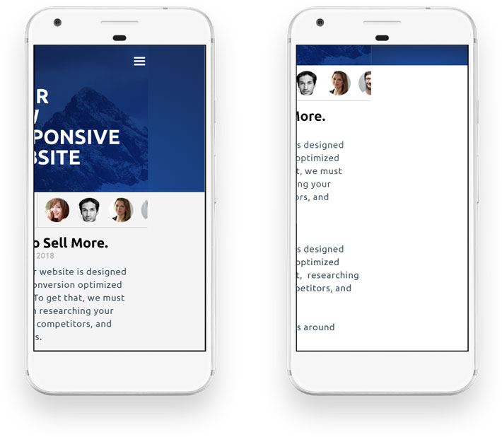
Your website should only scroll up and down, not left and right.
Forgetting the margins:
An easy oversight by a lot of web designers is the spacing between sections on the page.
What is a healthy amount of whitespace on a desktop can create large gaps of empty space on mobile.
If you have large gaps of white (empty or negative) space between elements or sections on your website that force obscene amounts of scroll, then you have a serious User-Experience (UI/UX) problem.
This can deceive the site visitor into thinking they’ve reached the end of the page, when in reality, they just need to keep scrolling.
But…even if they do, it’s a horrible experience.
Large vertical gaps of empty space trick site visitors into thinking they’ve reached the end of the page.
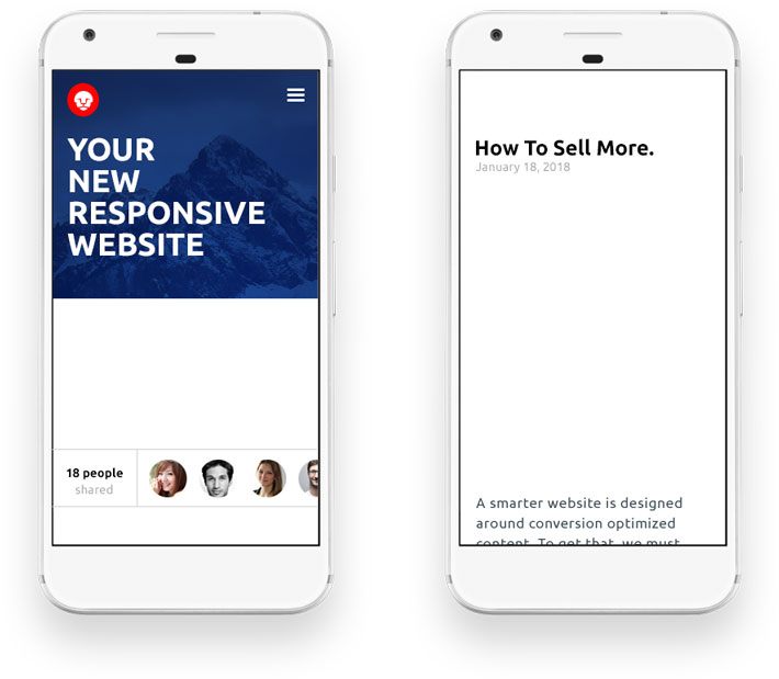
Stair stepping and bad recycling:
This is most commonly seen on ecommerce sites, but it can affect any website that has several pieces of content in a grid-like pattern (even if it’s only on one row).
This is often caused by elements that have either a height or width property out of control.
Forgetting the height can cause a bad stair-step effect that breaks your page layout.
Stair-stepping is a common problem when dynamic content isn’t accounted for properly.
Overlap:
This is another easy oversight when it comes to images.
It can appear anywhere, but it’s most common when an image size exceeds the size of its parent container. If the website isn’t coded properly these images can break out of their parent container and overlap other content.
To get technical, this is normally caused by a web designer not “clearing” something called a “float;” or not enabling the proper attribute for the “overflow” property; or forgetting to control how images resize.
Other common culprits can be misapplied margins or on-page positioning that’s been neglected for smaller screen sizes.

Images that break out of their containers destroys the readability of your website.
Fonts are either too small or too big:
There are hundreds of ways to skin a cat and even more ways to code a website.
Font sizes are often defined by a measurment called an “em” or “rem.” Other times they’re sized by “px” or “%.” There are even some websites that mix these altogether.
Needless to say, it’s not uncommon for websites to have fonts that don’t respond very well to different screen sizes.
If your page copy and images don’t resize appropriately, your website could become a pain to read if not impossible.
If your text is hard to read because it’s either way too large or too small, then you obviously have issues which will affect your user engagement.

Those large fonts on desktop should shrink to fit onto smaller devices, and those smaller fonts shouldn’t continue to shrink.
4
Your Website Performance
We need speed. Speed’s what we need. Greasy, fast speed!

Speed takes effort. It might feel like overkill, but if you don’t have it, you’re going to get hurt.
Dialing in your layout is important, but how your responsive website is coded is even more important.
A poorly coded website can really slow you down. A slow loading site ranks lower and is often abandoned by users without any profitable engagement.
Here are the most common culprits that are probably slowing your website down.
Minify your code:
Robots are fast, they don’t read code like humans.
There is a lot of white space, indentation, commenting and other areas of bloat in your code. That makes it great for humans, not so much for the machine.
Obviously, when your website is being built, the code needs to be readable for humans, but when your site is ready to go live, it should undergo a process called concatenation and minification.
This is a process that combines multiple code files into one single file and removes all whitespace and unneeded characters.
This lowers the overall file size of each web page and it’s dependencies. Without this, you’re delivering bloated files.
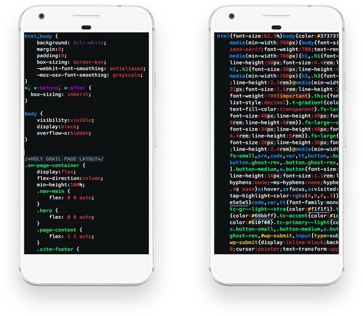
Your web browser doesn’t need to read the code the same was as your developer. Minify your code. Save space and file size.
Optimize your images:
Just like your code, your images should be optimized for the smallest possible file size.
Most websites will use images that are bigger than needed and depend on the browser to resize them. On a small level, this is fine, but uploading and using an image that is 4800px wide when it will never display wider than 1080px (or 480px for mobile) is a lot of wasted kilobytes being transferred that are not needed.
In addition to the physical size, there is a lot of metadata embedded in images that browsers do not need. Running your images through an optimization service will strip out all the unnecessary bloat.
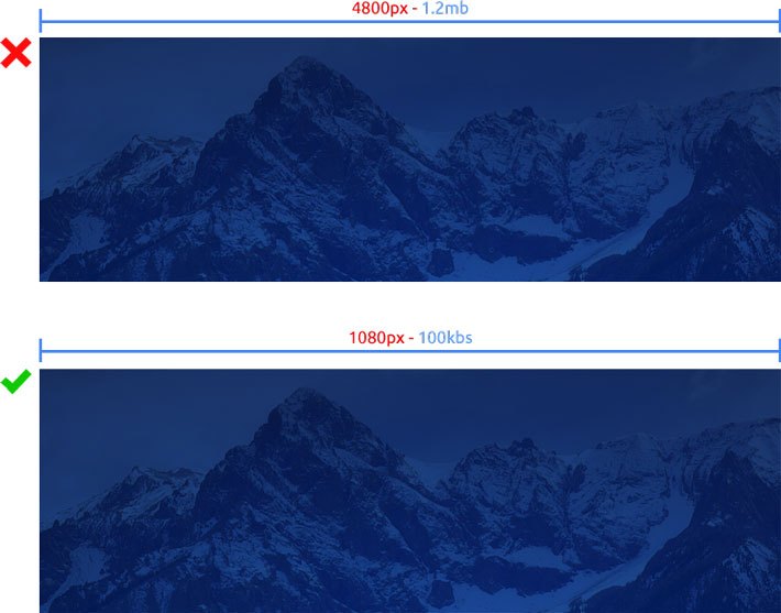
Just because it looks right doesn’t mean it is right. Stop displaying large images forcing the browser to shrink them down. It’s wasted bandwidth and it slows your website down.
Cache your static assets:
Any content that is not dynamic or user-generated should be cached. This means users see content quicker.
This allows the site visitor’s web browser to serve a requested web page that is pre-built and stored in the server’s cache instead of having to go to your server, run PHP scripts, hit your database, build out each page… for every single page visit… for every single user… every single time.
Set cache control or expiration headers:
Slightly different than caching your website’s assets, but very closely related to part of your cache process.
The expiration headers set a specific point in time when a resource is no longer valid.
This means, once a visitor arrives at your website, all your files are cached on their local system. The expiration headers tell the client how long each resource should be cached.
This allows the site visitor to browse and return to your website for an even faster experience as they are not needing to ping your server for files they already have on their system.
Enable compression for smaller file size:
Most modern web hosting companies are capable of compressing your website for file delivery.
Enabling compression can reduce the size of the transferred response by up to 90%, which will reduce the amount of time it takes to transfer your website.
Server response time:
Any content that is not dynamic or user-generated should be cached. This means users see content quicker.
The internet moves fast. Really fast, but sometimes a cheap hosting solution doesn’t… that’s kind of why they’re cheap.
Google prefers a server to provide a response in less than 200ms.
If you’re on a cheap host, you’re not only serving a slow website, you’re telegraphing to Google that… maybe… your website isn’t all “that” important. I can’t say that with any authority outside of this – Google hates slow web servers and uses server speed as a page ranking metric.
Render Blocking Assets:
I saved this one for last as this is a pretty hotly debated item.
Google recommends that only the Javascript and CSS that is needed for initial page load (only what is visible before any scrolling action) be inlined (embedded) inside your HTML document. Anything that is not needed for page layout or functionality until you scroll down the web page is recommended to be served in a separate file.
The reason being, a separate file is an additional resource to transmit and process vs. having everything needed, and only what is needed, inside the single served file.
This can create its own set of problems if implemented.
Suffice it to say, unless you’re serving 10’s of thousands of visitors a day (in which case you most likely have a development team and do not need this article), or you have an incredibly small/simple site, you’re just as fine to let this one go.
5
Summation
Having a responsive website that performs properly for your human visitors and the Google page crawlers is imperative today. If done with care, your website can and should please both.
Remember, your number one goal with your website is ALWAYS your site visitor. Google is very important and you should do your best to get a perfect score, but most of the time, it’s just not possible, not without sacrifice.
So if any error or warning reconciliation diminishes your site visitor’s experience, then chose your site visitor.
Resources
Test your website usability here: Testmysite.withgoogle.com
The article that started it all? Responsive Web Design
The original responsive screencast: CSS Tricks Screencast
Google’s responsive best practices: Responsive web design fundamentals
